Cat concept:
Monday, 31 October 2011
Sunday, 30 October 2011
Concept Art
Thursday, 27 October 2011
more concept art/logo design
Here is some other takes on the 4 birds concept piece/logo I have done, I have done quite few of these to explore which ones work the best. I decided to do a couple neon versions as my animation is moving in that direction. I will present these images to my tutor to see which one's are (if any) successful.
Concept Art
Here are some concept pieces I have done, I am not sure which ones I will use (if any) for the pitch, but I do feel they give an idea of how I would like the animation to look like, as I have decided to move onto painting everything glowing on top of a black background to give a neon type look.
Sunday, 23 October 2011
Some more tests
Here I merged the Kalediscope efffect I had created as a texture over the surface texture of the line test to see what effect it would have, again some are more successful than others but I am impressed with one or two of them and am considering using this and developing this idea further.
After Effects
I used the concept art image I posted previously and manipulated it in Photoshop to then experiment with in After Effects. I was trying to manipulate the image to imitate a neon kaleidoscope feel.
Friday, 21 October 2011
Neon Line test
Here is a quick render on what I have been working on. Like my previous line test I started animating in Toon Boom then painted the contours in Painter 12. I am trying to go for a bold Neon like style here using a thick textured brush. I then experimented in after effects to change colour's and explore Glowing effects.
Line test toon boom:
Painter:
After Effects:
transition: (the most successful out of the tests)
glow test
Line test toon boom:
Painter:
After Effects:
transition: (the most successful out of the tests)
glow test
Concept Art
I have been working on some 'Wow images' for the pitch, some I feel are more successful than others, but I will post them all on here none the less:
Eagle Concept art:
Eagle Concept art:
Thursday, 20 October 2011
stay tuned
After speaking with my tutor i have started to think of ways to cut down on some of my animation work, one of them is to have a 'neon' Esq, scene style, which will cut out animating backgrounds and focus on contour and movement rather than fully painting the figures on the screen. The picture above is a preview of how the style could look like.
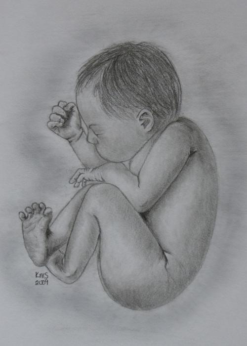
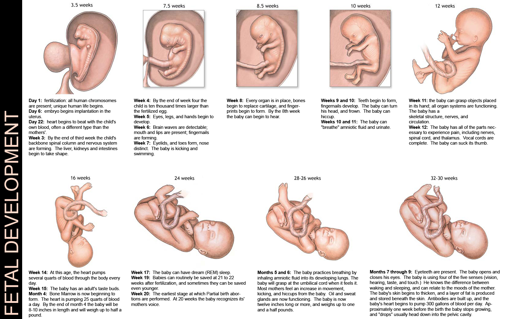
I have also been working on an animation test regarding the first 8 second of the film which focuses on the stages of Pregnancy, while trying to come up with a storyboard/image sequence.
Wednesday, 19 October 2011
oo la la
a concept piece on love and a potential shot from the animation and how it is likely to be rendered as:
Eagles, eagles everywhere
Here is a design sheet and a concept piece to illustrate the Eagle figure and who it will potentially be rendered within the animation. Since the animation is loose and experimental, I am interested in presenting movement with line and form over the images represented within the film.
Wednesday, 12 October 2011
Animation test
Here is an quick animation I did of a water drop in order to test whether the software Painter could be used in the way in which I anticipated, overall I am happy with the results. The line test was done using Animate animating on 2s.
Line Test
Painted:
Line Test
Painted:
Lejf Marcussen
My new favourite animation....its really THAT good!
Den Offentlige Rost (The Public Voice, 1988)
Den Offentlige Rost (The Public Voice, 1988)
IMPRESSIONISM
As you have probably guessed by now, the animation style is heavely based on Impressionism because I feel the movement of the pieces are incredible and fit perfectly with the animation medium.
What you probably haven't guessed (unless you are the mouse in my brain) is that I have began researching into using Stereoscopic animation and have decided to explore the imagery I use based around this medium. I will be posting more about this soon. For now here is some Monet:
What you probably haven't guessed (unless you are the mouse in my brain) is that I have began researching into using Stereoscopic animation and have decided to explore the imagery I use based around this medium. I will be posting more about this soon. For now here is some Monet:
Tuesday, 11 October 2011
Development work
As I mentioned earlier I have been working in painter as I feel it really defines the loose, mixed and textured feel I am aiming for within the animation. Below are some concept pieces on dandelions:
Painter and Oil Brushes
I have been experimenting with the software Coral Painter and am rather keen to use it for the colouring process in order to mimic the style of a traditional oil painted animation. I will be posting some of the inspirational concept pieces I have been working on, but for now here is a palette list of all the differing textured oil brushes available in the software that may be used within the animation:
Monday, 10 October 2011
Plant Life
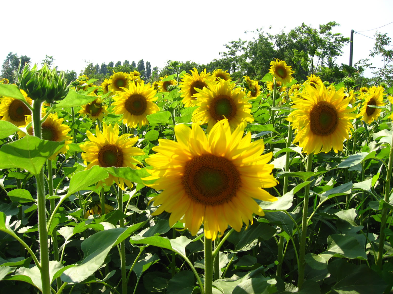
Below are the chosen examples of plant, foliage natural imagery I have chosen to incorporate within the animation.
The 'Sun' Flower:
The Maple leaf:
Dandelion Seed:
Pine Cone:
The Track
This is the song I have chosen for the piece, it was composed by my father and I thus have the rights to use it.
07 Stream cut by Juan Montana
I have spoken to my tutor and he has advised me to cut the animation run time to around 3 minutes. I have thus made a rough cut of the original song that cuts off around 3;16. (I will fade out the song towards the end when I come to use it within the animation)
If you would like to hear the full song the version is here:
07 Stream by Juan Montana
Come Together: The Human Figure
The Suit from A Scanner Darkly directed by Richard Linklater
God in Mind Game by Masaaki Yuasa
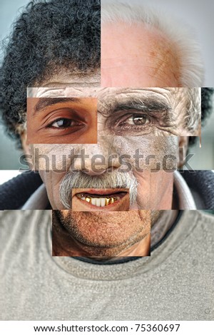
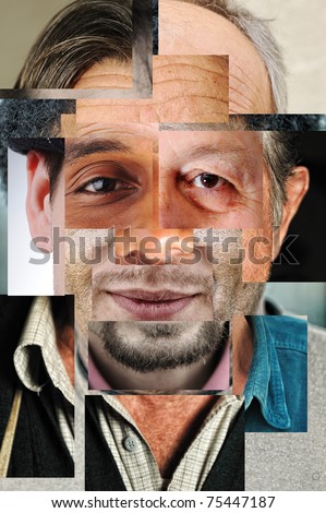
In order to express the idea of human equality I have decided to present the adapting human figure through collaging differing sexes, races and ages all as one. It will not be used in the same way as these animations will, however they will be used as a source of major inspiration.
Subscribe to:
Comments (Atom)


